Changing of the Seasonings: NaCl Redesign

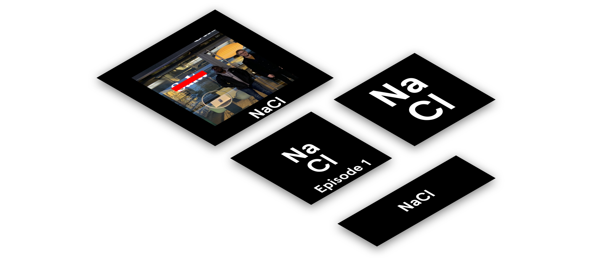
You may have noticed that the NaCl Twitter page and podcast images get a bit of a revamp in recent weeks. This is part of our careful, considered design system that evoques the spirit and feeling of the podcast.
We poured our heart and soul into this design and project, and hope that this effort is apparent to you, the listeners.
Typeface
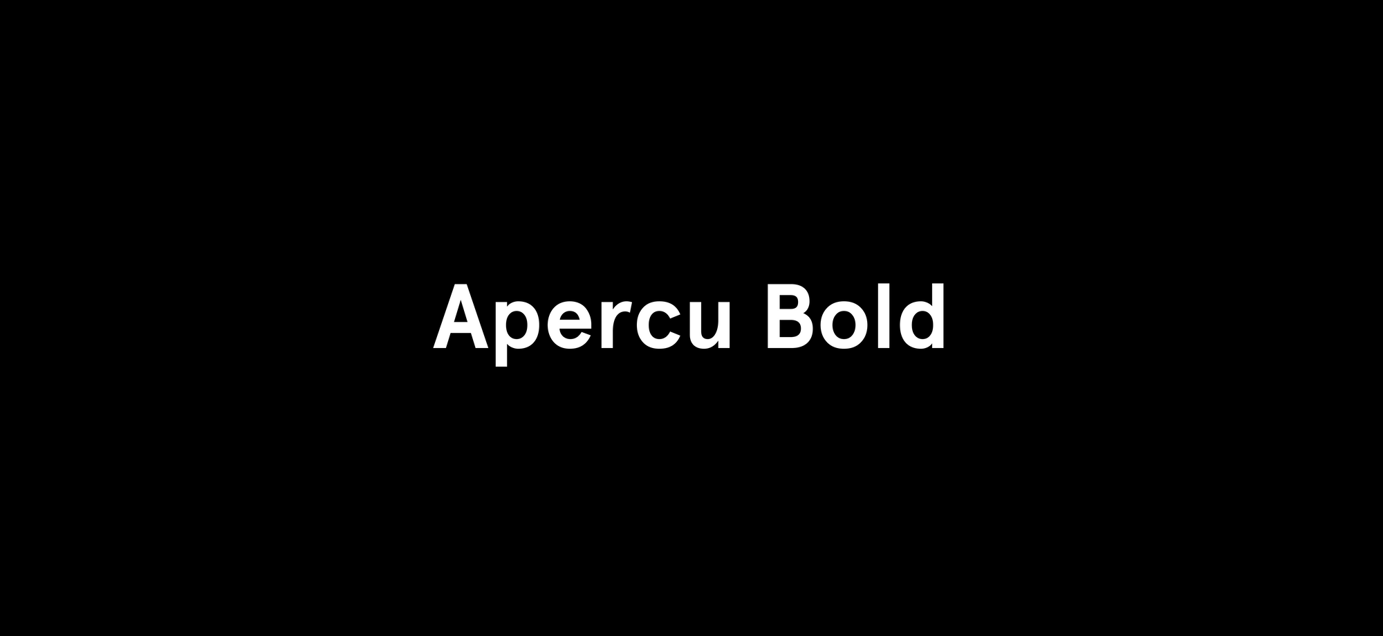
We chose the Apercu Bold typeface for all of our branding. Bold. Striking. Yet slightly humanist and warm. Apercu represents the short, punchy episodes we release. We chose the bold version so that it works well as lighter text on darker backgrounds.
Our chosen typeface works beautifully as our logotype, representing our brand on our social media accounts. It also works splendidly as part of our main podcast cover image, presenting itself as a caption below the hero image. It draws the viewers' attentions in, brazenly expressing the name of our podcast.
Colour
Picking the right colour scheme for our NaCl design system was excrutiatingly difficult. Myself and Abdul went through hundreds of palettes, struggling to decide which shade of cyan—and which gradient—stood out and said "NaCl" to us.
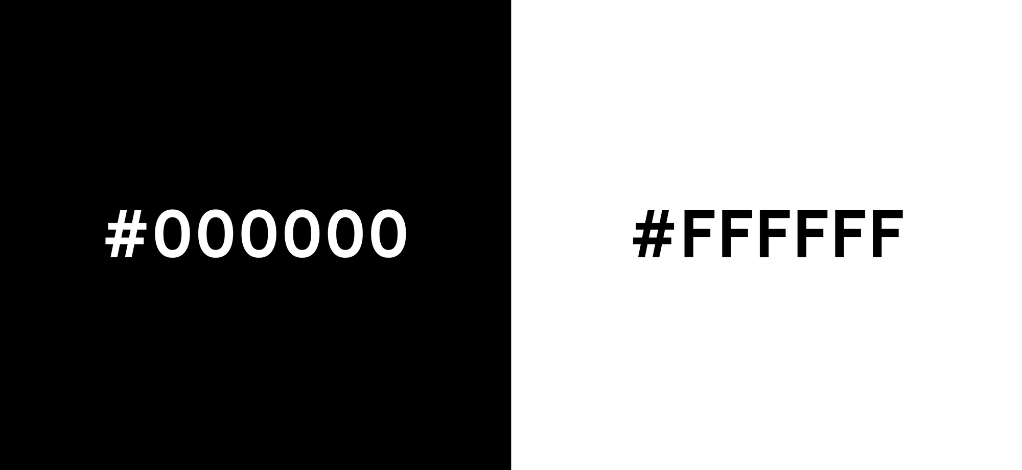
Ultimately, we decided less is more, and chose a stark, bright white, against a cool, collected black. The two exist as polar opposites, a metaphor describing the opposites of opinion Scott provides in contrast to mine and Abdul's opinions. One cannot exist without the other.
Podcast Image
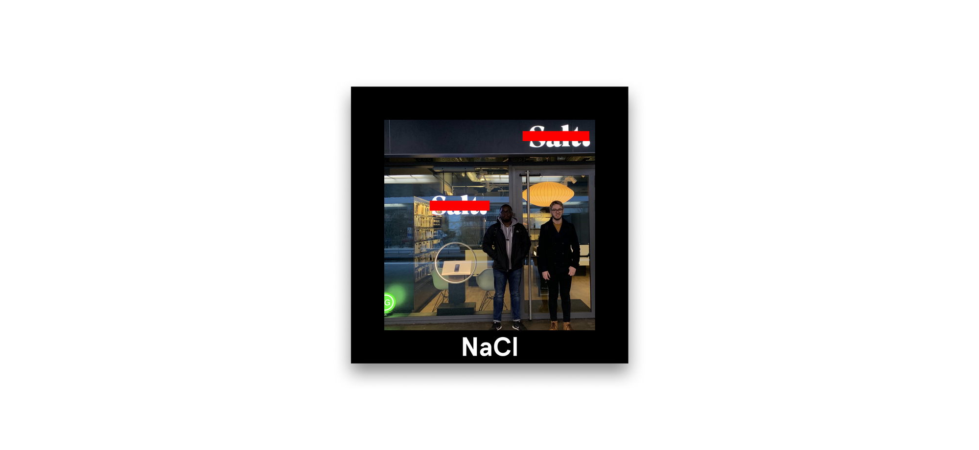
The image is something we think is very special. It culminates the entire ethos of NaCl, including fixing the spelling, and showing the faces behind the voices. We use a stark, striking red to remove the erroneous logos and place the correct logo below. It took us the whole of 10 minutes to make.
More to come
This is the new NaCl design system; and we think you're going to love it. Check out the latest episodes at the NaCl website.

